Interior decorating, Interior decorating trends
Basics of minimalist interior design
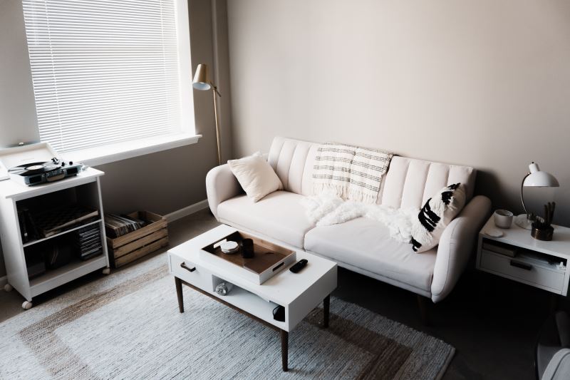
Minimalism has been taking the interior design world by storm and the rise of platforms such as Pinterest has helped minimalism slowly creep into more homes across the nation. Minimalism can help create calm and happiness in your home.
If the minimalism bug has bitten you, or you just want to see what this minimalism craze is all about, then this guest post from Chloe Smith will point out a few cornerstones in minimalist interior design to get you started. We’re going to explore the notions of decluttering, colour choice, geometry, and balance in minimalism and how applying these notions in your own home will get you that sweet minimalist design that everyone is looking for.
Declutter
Minimum is the name of the game here. To achieve a minimalist look, you’ll want to reduce clutter in your home to a minimum.
Minimal art is simple in nature and creating a simple shelf space is easier said when there are fewer items on the shelf in the first place. That’s not to say that you should keep an empty shelf!
Go through your home and systematically decide what deserves the importance of being displayed in your home.
The fewer items there are competing for attention, the more important the items left are. For example, if you have a shelf that’s covered in photo frames to the degree that they’re covering one another and some can’t be seen, consider creating a rotation of images that you can change once in a while to give each picture a moment in the limelight and keep your shelf fresh.
Colour Choice
As said previously, minimalist interior design is the process of simplifying spaces in your home. As a result, it’s hardly surprising that minimalist interior design tends to favour whites, greys, and generally more muted colour schemes overall.
Minimalist colour choice is an exercise in decluttering your walls. By creating simplified and toned down walls through colour choice, it becomes easier to create points and zones of interest in a room to stand out. For example, having one wall in a room in a stark colour while the rest are muted creates a stark contrast and is an excellent way to immediately define the purpose of that room. If you have a room dedicated as a study, placing that stark colour behind the desk draws a viewer’s eye to that desk and immediately establishes the most important feature of that room, the desk, ultimately establishing that room as the study.
Minimalist colour choice helps guide the eye as much as decluttering does.
Geometry

Geometric shapes are a common theme in minimalist interior design. Simply lined lampshades, non-complex square coffee tables, and simple mirrors and picture frames are just a few examples of items commonly seen in a minimalist home. After all, the simple geometric shape goes hand in hand with minimalist design.
By sticking to these muted shapes in item and furniture selection, geometric shapes allow for a decluttering effect to create zones of importance in the home. A wavy and wacky mirror will pop out more in a room filled with geometrically simple furniture.
Balance
As a result of simplifying decluttering a space, the concept of balance becomes more important. With fewer items and a more muted palette to work with, the danger of unbalancing a room becomes evident. While we’re striving to create zones of importance, if we push too hard, we’ll create a space that is entirely defined by one item, a room imbalanced in that viewers are lost in a sinkhole of importance.
Each piece of furniture should correlate with others in the room in an appropriate way. While it might be fun to create a muted space and then throw in a super funky couch, that couch needs support from the rest of the room in order not to drown out the rest of the room. Try creating a repeating idea throughout a room with colour.
If your room is predominantly white, introduce items of a single colour to match together that you can use to balance especially empty portions of the room. For instance, using a yellow couch in a predominantly white room should be supported by yellow table lamps in the corners of the room, or a few yellow vases, or a mostly yellow painting on the opposite wall. You’re trying to spread that yellow across the room while allowing the couch to be the centrepiece it deserves to be.

If it hasn’t been hammered in enough yet, minimalist design is the process of simplifying a space to more easily create zones of interest and importance in a stark and stunning manner. Your goal in hunting minimalism is to declutter your home, create a more muted environment to work in with colour choice and to carefully choose items that are geometrically simple. The redesign doesn’t stop at the living room or your bedroom, it spans all across your home – the kitchen as well.
Opt for kitchen refurb supplies if you find it impossible to work with what you already have, and do a remodel. However, it’s extremely important that you don’t forget to balance all this muting with tasteful emphasis so that you don’t create a sterile environment. We hope this article helped you as you take your first steps into minimalist design.
Good luck! May the elements of decluttering balance ever be in your favour.
About the author
Chloe Smith is a business consultant and a part-time writer always willing to share tidbits of advice. She believes that passion, courage and, above all, knowledge breed success. When she’s not working, she’s probably somewhere cuddled up with a good book, and a cup of lemongrass tea (or more honestly binge-watching the newest Netflix hit show).


