
Bedroom design ideas, Colour schemes
Setting the mood: colours for creating a calming bedroom
Jan
We usually don’t spend a lot of time thinking about the room colour, as long as it goes well with our furniture. But colours have a big impact on our mood and thoughts. They can make us serene or cause anxiety, provoke happy thoughts, or be depressing. While the choice of colours is essential for every room, it might be the most significant in your bedroom, since it affects the quality of your sleep. Here are some suggestions from guest blogger, Tracey, that could help you set the right mood in your bedroom, without compromising the style.
The soothing power of lavender

It is common knowledge that the smell of lavender (the flower) puts you in a relaxed state, but did you know that the psychological effect of the colour is no different than the flower? The colour of lavender encourages calmness, relaxation and healing, all the things a properly designed bedroom should inspire. Because it has grey undertones, it goes well with grey furniture, and its femininity can be toned down with black accents (accessories, cushions, throw blankets…).
Speaking of grey…

Grey is clearly the underdog of neutrals, and for too long, it has been considered a boring colour. However, the shades of grey are so diverse that everyone can find the one that matches their taste. This color is the staple of the currently popular interior design approach – Scandinavian. Take it from this style and warm up the traditionally unloved coolness of grey with the addition of pastel bedding, faux fur rugs and metallic tones.
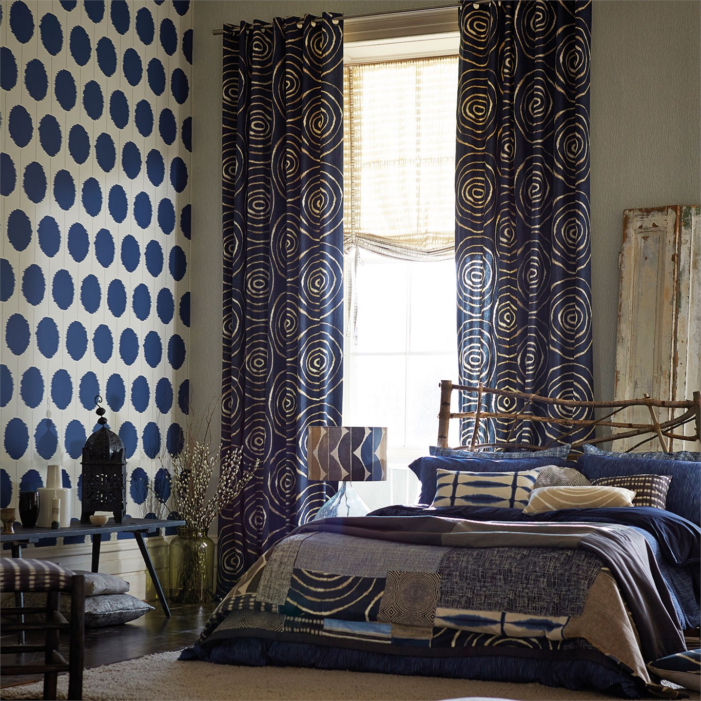
Right out of the blue

According to the colour psychology, blue is believed to slow down breathing and the heart rate, which links it to meditation, relaxation, serenity and inner peace. It is also non-threatening and inspires trust, which is definitely what you should try to achieve in your bedroom. When painting your bedroom blue it is always better to go with the less saturated shade, because the opposite would provoke focus, productivity and energy, rather than calmness. A lot of colours go well with blue. If you browse through the offer of cushions in Sydney, you will see that different designs and colours, ranging from dark blue and black to pastels can fit into your bedroom design.
The whole world is green

Green is the neutral colour of nature, and it depicts renewal, growth, harmony, equilibrium, and most importantly, spring. Since it is the most prominent representative of nature among colours, green is also very soothing – just what your bedroom needs. However, we suggest avoiding overly vibrant shades of green, because too many stimuli can be bad for your serenity. Gentle shades of green should be prevailing in the bedroom design, while more saturated greens can serve as accents. Warm neutrals are the perfect choice for furniture, bedding and drapes.
Let the sunshine in

Although yellow seems as an unlikely colour for the bedroom, a survey conducted by Travelodge showed that it is the second best colour for sleep. This is true mainly because certain shades of yellow stimulate the nervous system to aid relaxation, but also because yellow creates a warm cosy ambience which makes the bedroom more pleasant. Decorating with yellow is not a breeze because you need to refrain from going overboard with saturation and details. Keep it toned down with warm-neutral furniture and white bedding and drapes.
Sweet caramel

The same survey mentioned in the previous paragraph revealed that couples who decorated their room in light brown colours have sex three times a week, which is more than with any other colour. Regardless whether this is true or not, light brown combines the similar warmth the yellow colour carries with classic neutrals that are peaceful and very sophisticated. The best colours to complement your caramel bedroom are deep tones of beige, whites and some blues, but you can also include orange accents.
A good night’s sleep is something that shouldn’t be sacrificed, even if the price is good taste. Fortunately, these colours evoke quality sleep without requiring any style compromises. So make your choice, grab your painting brush and start working.
About the author
Tracey Clayton is a mum of three girls. She’s passionate about fashion, home décor, and healthy living. Her motto is: “Live the life you love, love the life you live.” You can find her on Facebook.